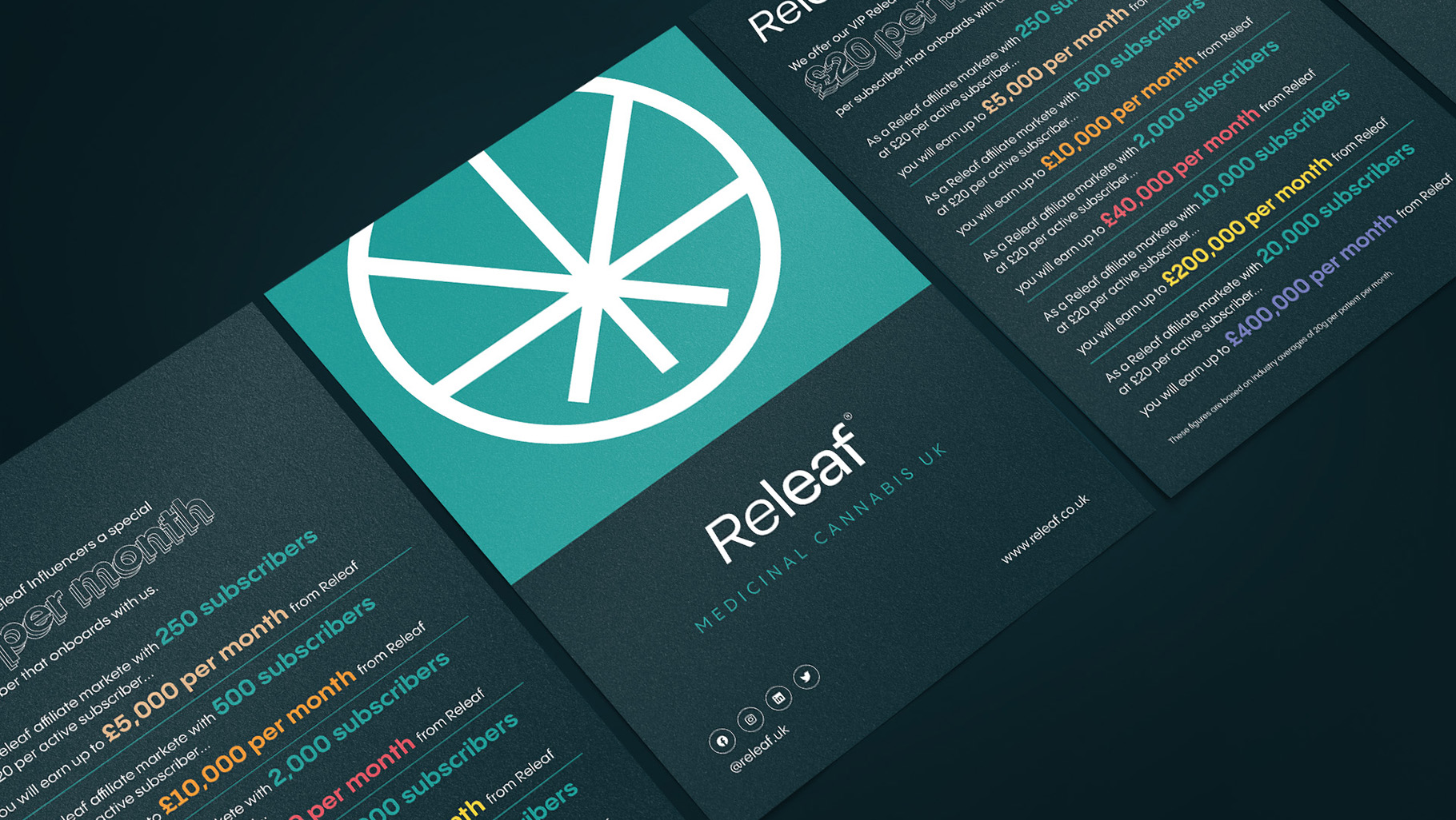
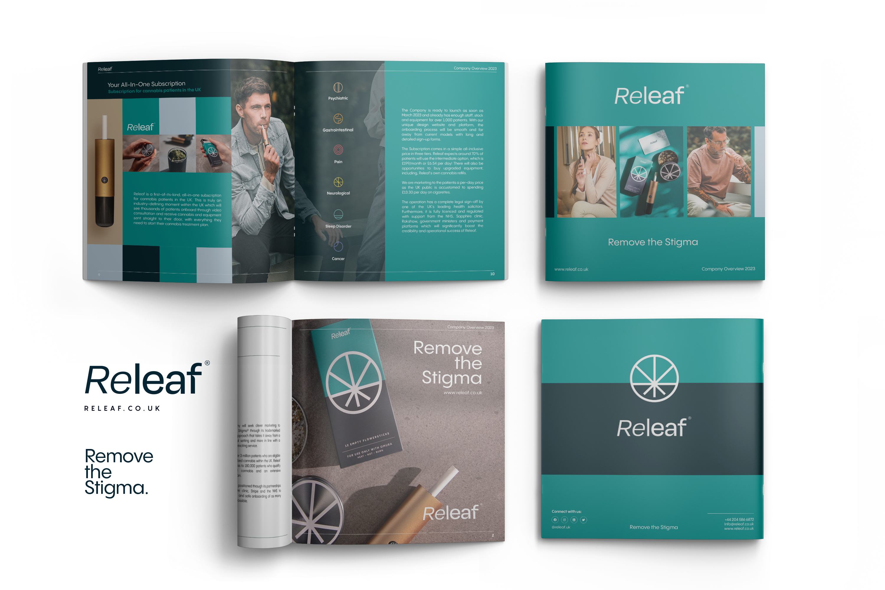
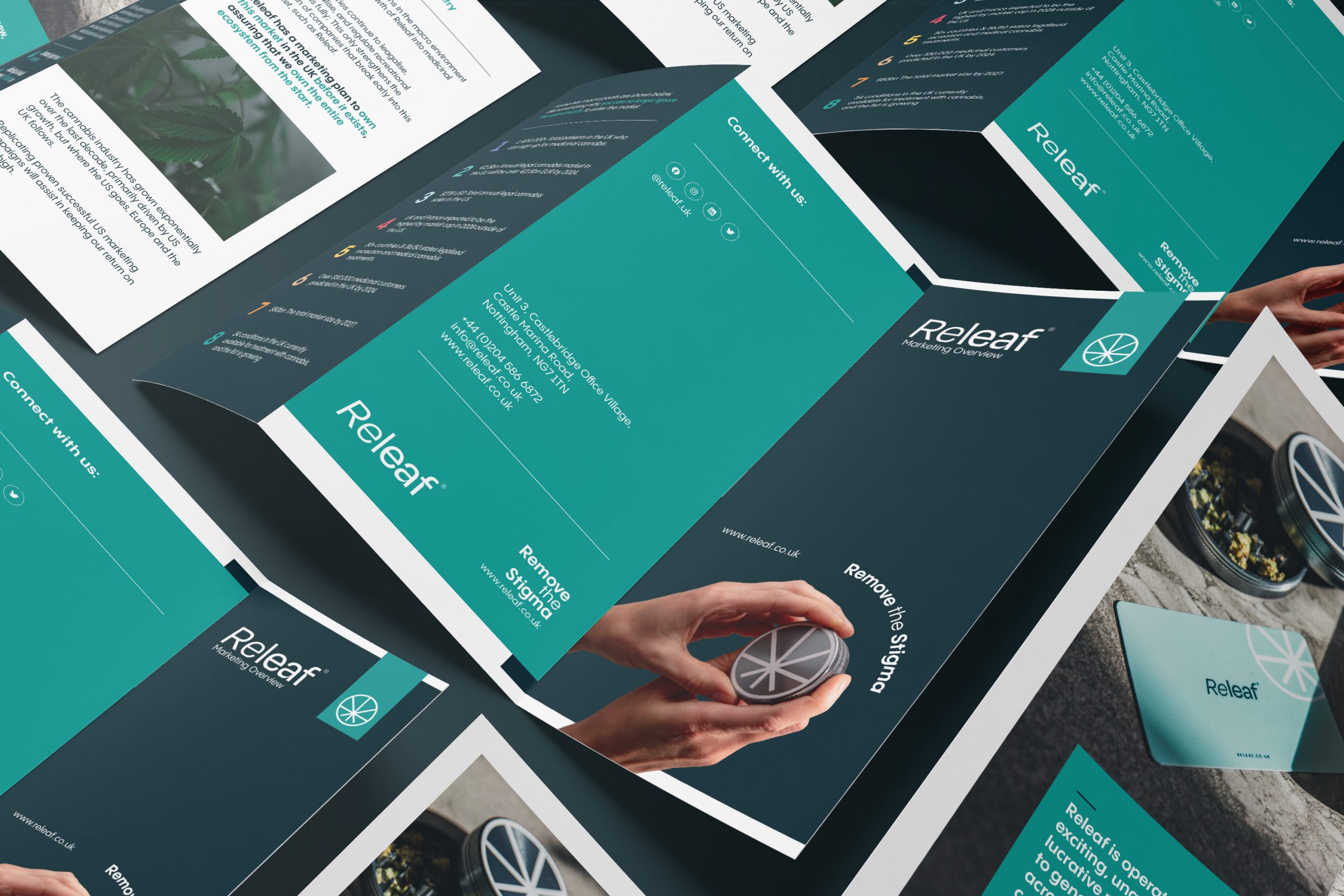
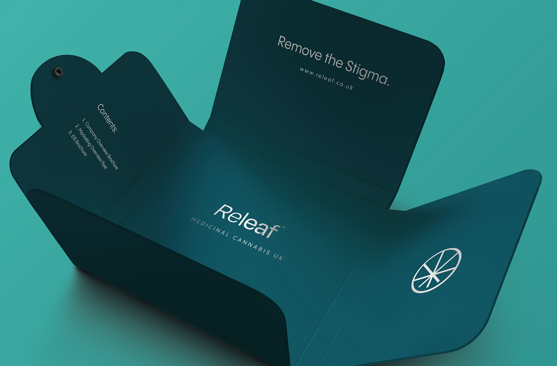
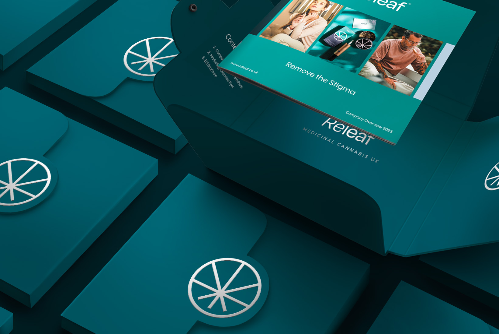
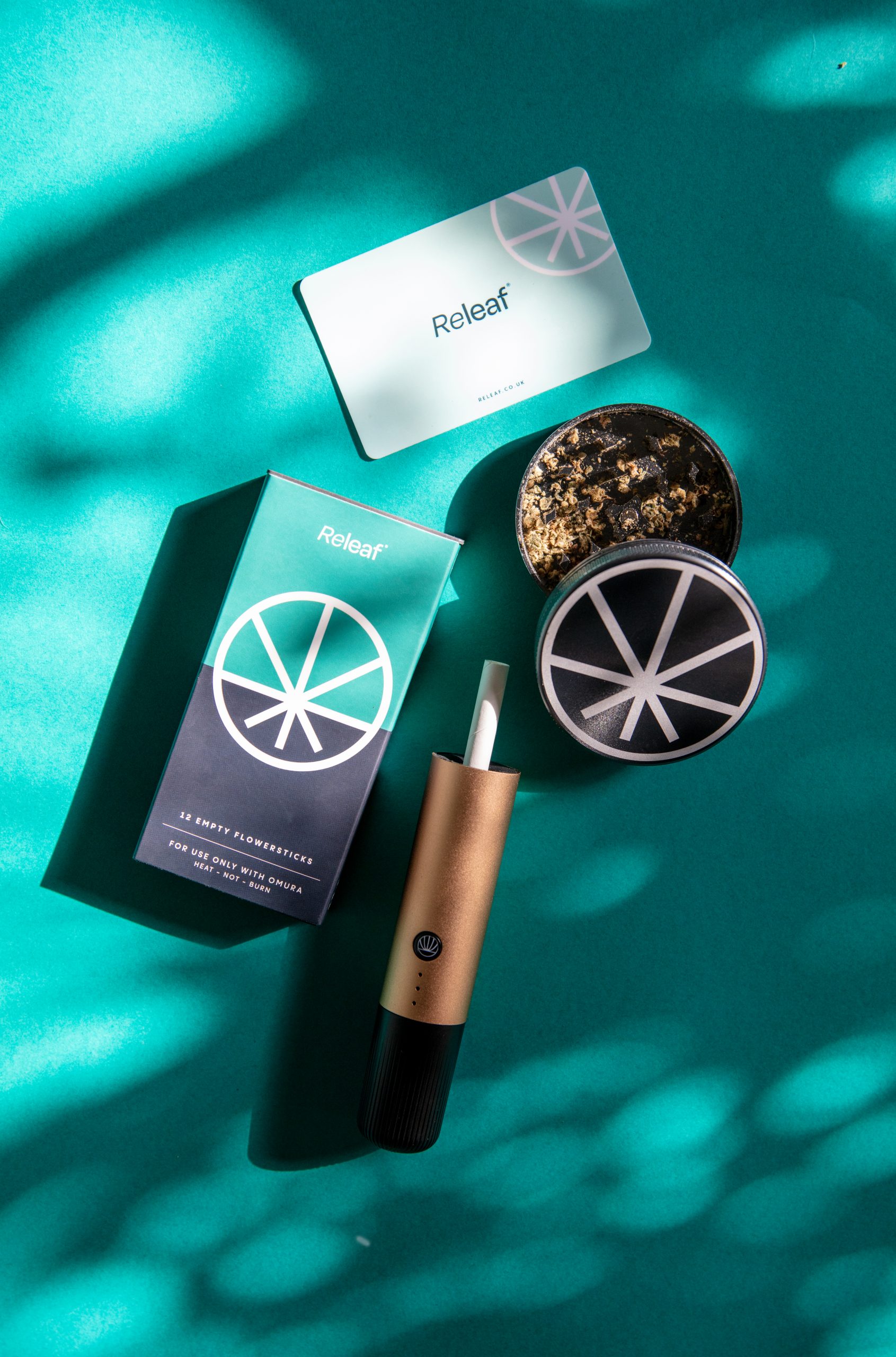
During my time at Xcellorate, a key aspect of my role involved supporting Releaf in maintaining brand consistency across various mediums such as brochures, flyers, business cards, packaging, and other promotional materials.
Drawing upon Releaf’s distinctive brand colors and design guidelines, I applied innovative strategies to enhance their advertising presence throughout the UK market.
Our collaborative efforts contributed to Releaf’s success in securing lucrative business deals through targeted marketing initiatives.
Releaf Ltd. Scope:
Corporate
Technological
Startups
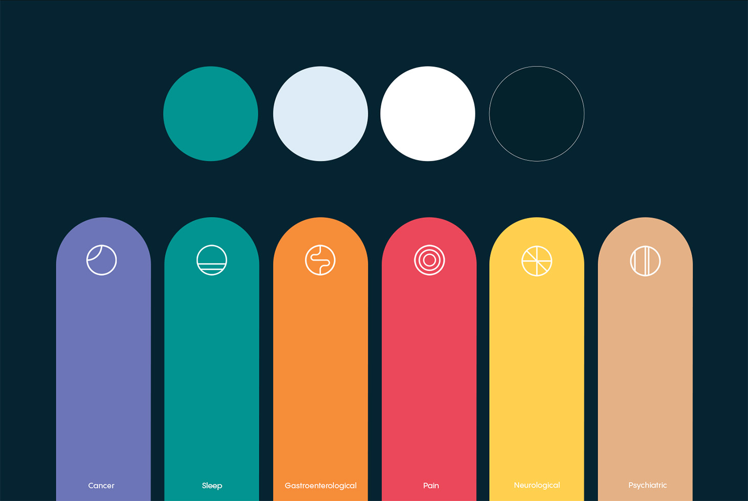
Medicinal
Agricultural
Additional Credits:
Packaging and Photography by Releaf
Model and Product Photography by Releaf
Logo design by Releaf
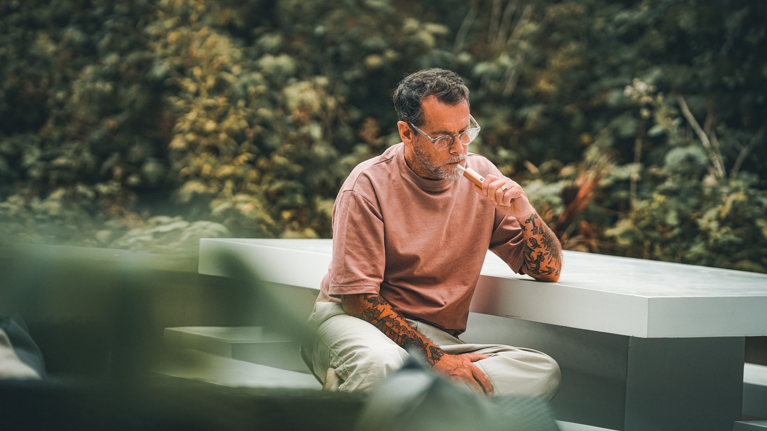
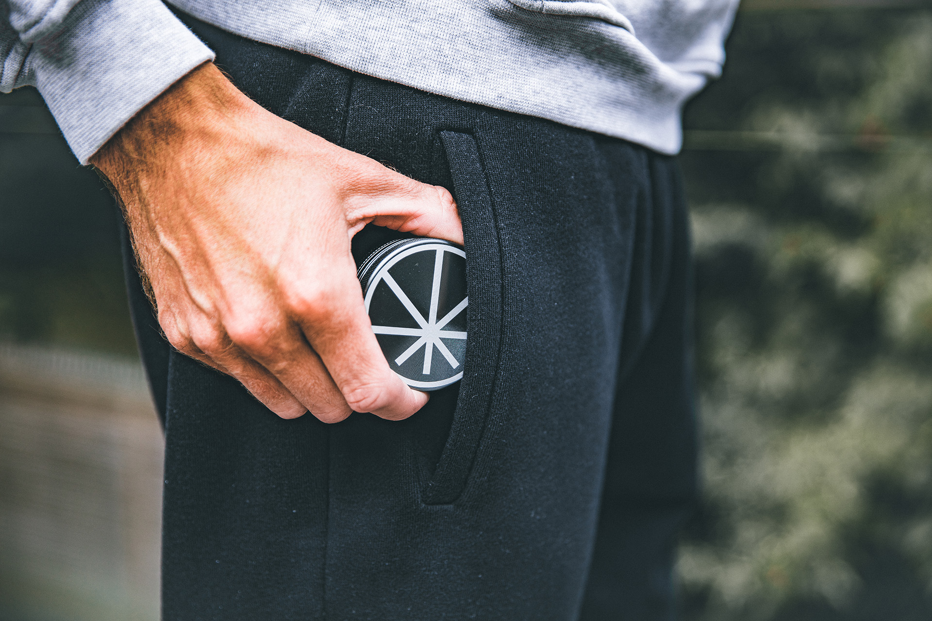
About Releaf
Releaf is a health-tech start-up revolutionising patient access to medicinal cannabis treatments in the UK. They are the only all-in-one clinic in the UK, seamlessly integrating all stages of the patient journey.
Logo
The logo of Releaf embodies the cannabis plant, effectively representing their primary business objective. Additionally, their chosen typeface exudes a sense of tranquility, catering to the clientele who seek Releaf’s products for their health benefits.
Brand Tone & Visual Language
Releaf’s typography was chosen based on their logo. As their typeface in the logo represents calm, so should their typography across all platforms.