
La Farina brand design
La Farina, a cozy pizza and pasta restaurant in Wimbledon, approached me for a brand redesign that feels modern and appealing to a younger audience while preserving its Italian roots and classic pizza-themed colors.
La Farina Scope:
- Logo Design
- Rebranding
- Marketing Material
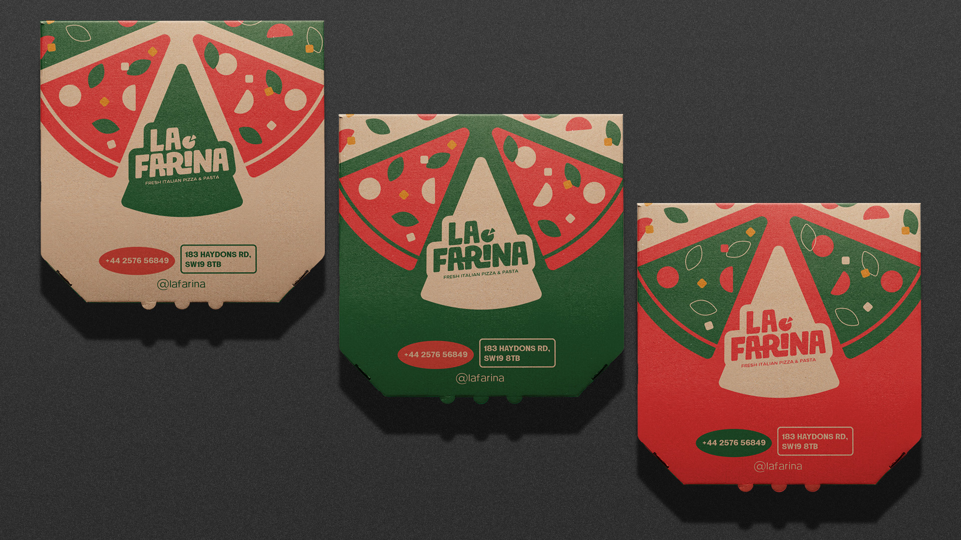
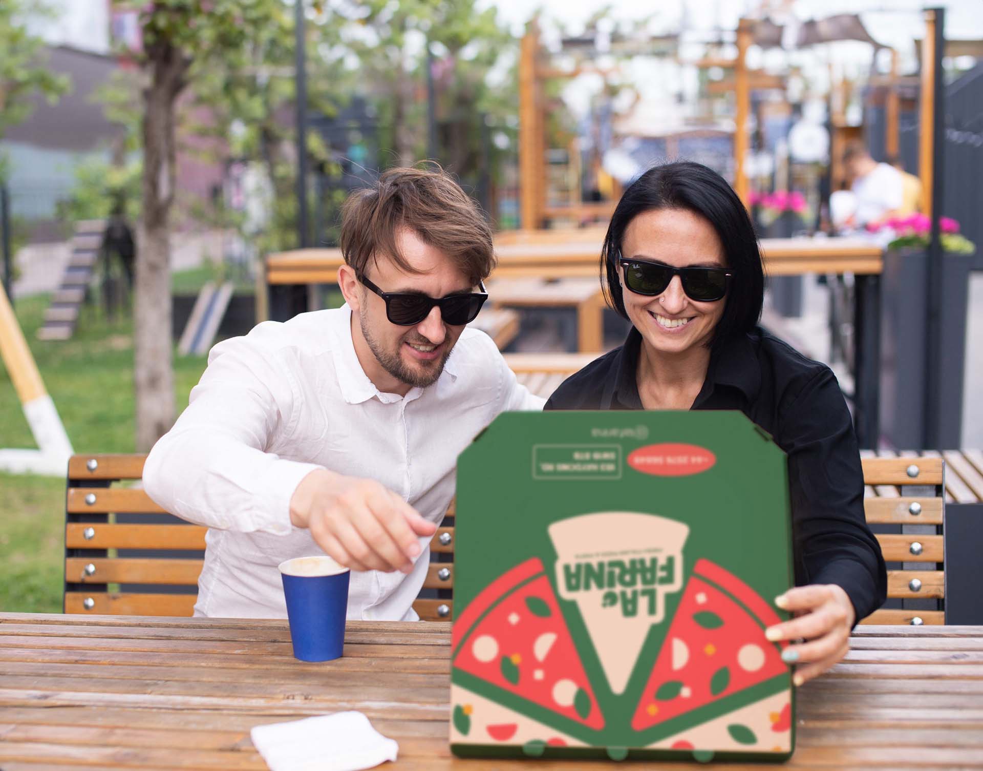
- Packaging
Additional Credits:
- This is purely a conceptual design and does not yet reflect the food chain’s official branding in any way.
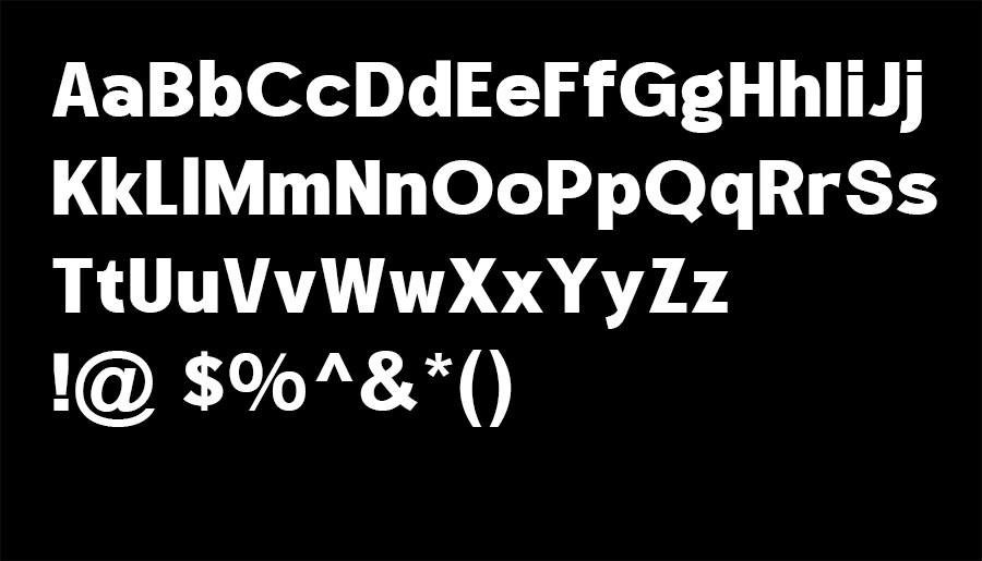
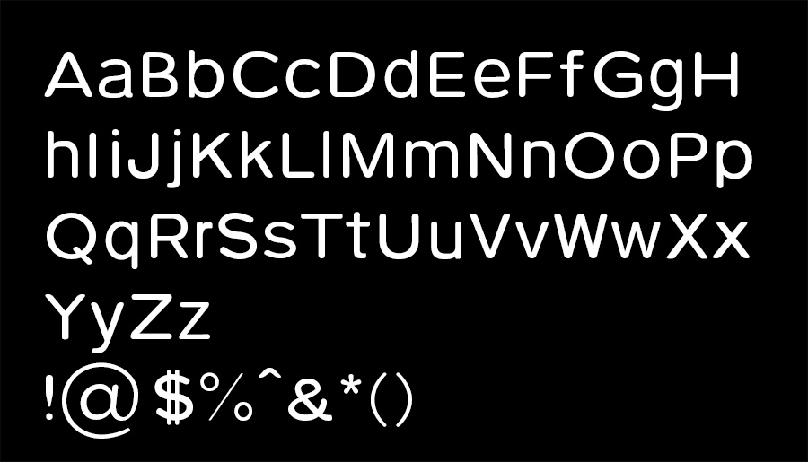
Typography – Hando Soft
Brand Tone & Visual Language
For La Farina’s brand design, the goal was to create a fresh, youthful identity while staying true to its Italian heritage. The design blends contemporary aesthetics with classic warmth, using a refined color palette inspired by traditional pizza hues. For typography, Gleffy Regular was chosen as the heading font due to its bold and sharp characteristics, giving the brand a strong and confident presence. In contrast, Pulse Rounded was selected for the body text to introduce a softer, more inviting feel. The rounded edges create a friendly and approachable tone, balancing the striking headlines with warmth and readability.
Gleffy Regular
Lorem ipsum dolor sit amet, consectetur adipiscing elit. Ut elit tellus, luctus nec ullamcorper mattis, pulvinar dapibus leo.
Pulse Regular
Lorem ipsum dolor sit amet, consectetur adipiscing elit. Ut elit tellus, luctus nec ullamcorper mattis, pulvinar dapibus leo.
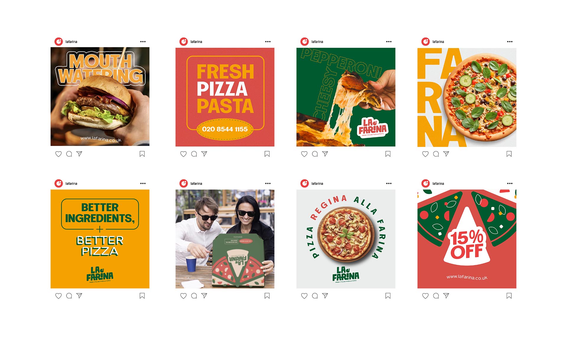
Colour
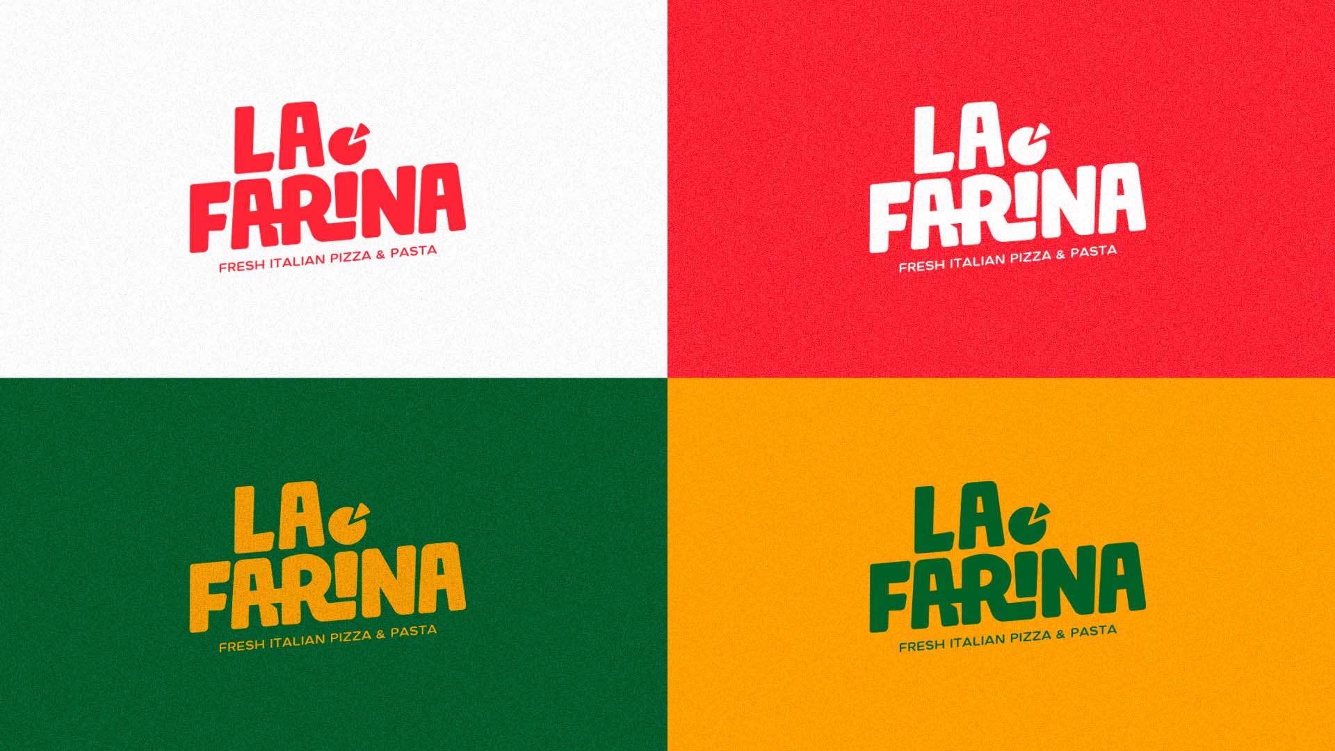
The color palette was carefully chosen to reflect both its Italian heritage and a fresh, inviting aesthetic. The combination of green, red, yellow, and white pays homage to traditional Italian culture and cuisine. Green represents freshness and high-quality ingredients, red symbolizes passion and the rich flavors of Italian cooking, yellow evokes warmth, energy, and the golden hues of baked pizza crusts, while white adds balance and simplicity, keeping the overall look clean and modern.
Brand Identity
The balance of striking typography and warm, familiar colors ensures that La Farina stands out as a contemporary yet authentic pizza and pasta restaurant.
Brochure design & templating
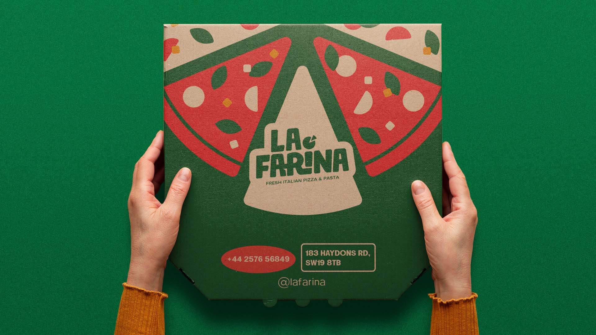
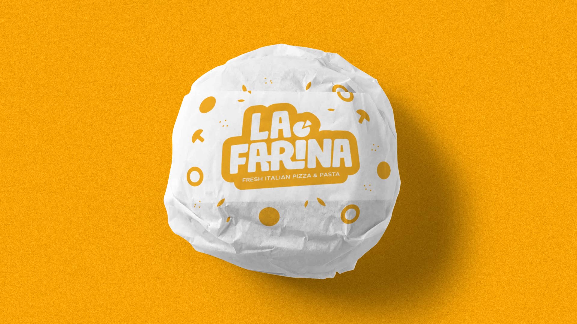
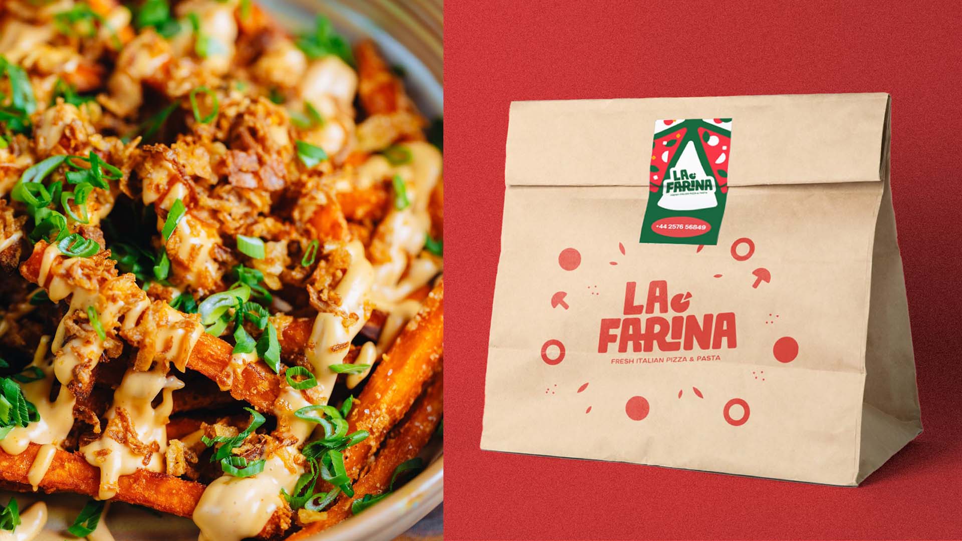
La Farina’s brand features flat, single-color, minimalistic geometric shapes representing pizza toppings to create a clean, modern, and visually striking identity. The use of flat, geometric shapes keeps the design abstract and versatile, avoiding overly complex or realistic imagery.
Illustration Style
