Frecycle rebranding and Corporate Identity Design 2023.
Undertaking this project at Xcellorate proved to be a considerable task for me. As the sole designer at the time, the responsibility for crafting the entire brand along with its illustrative and marketing components rested solely on my shoulders.
My objective was to design a brand that both had a sense of enjoyment and professionalism. The aim was to ensure that users of all ages, from the younger demographic to older individuals, would find delight in the brand’s user experience.
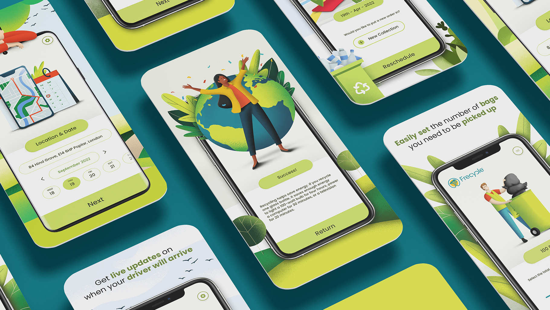
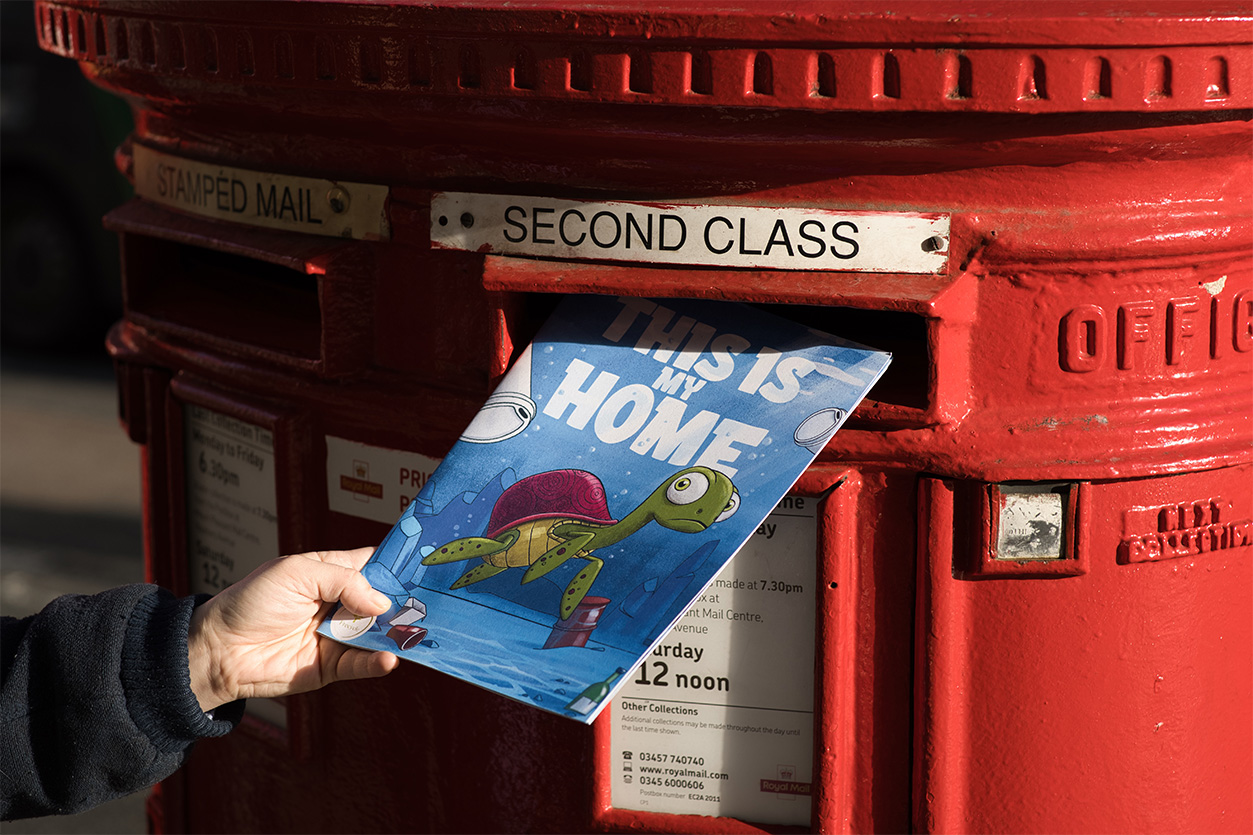
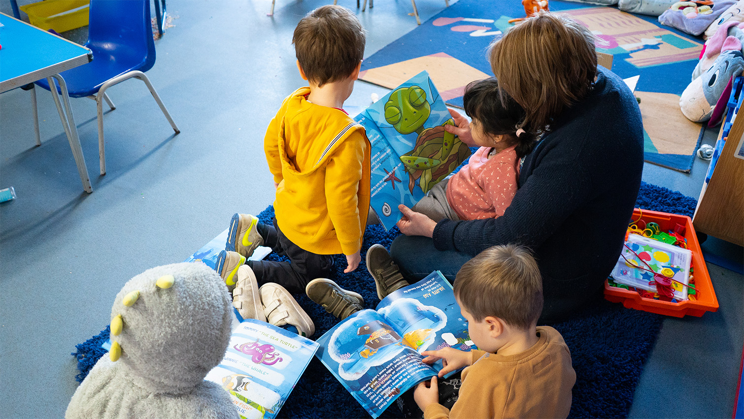
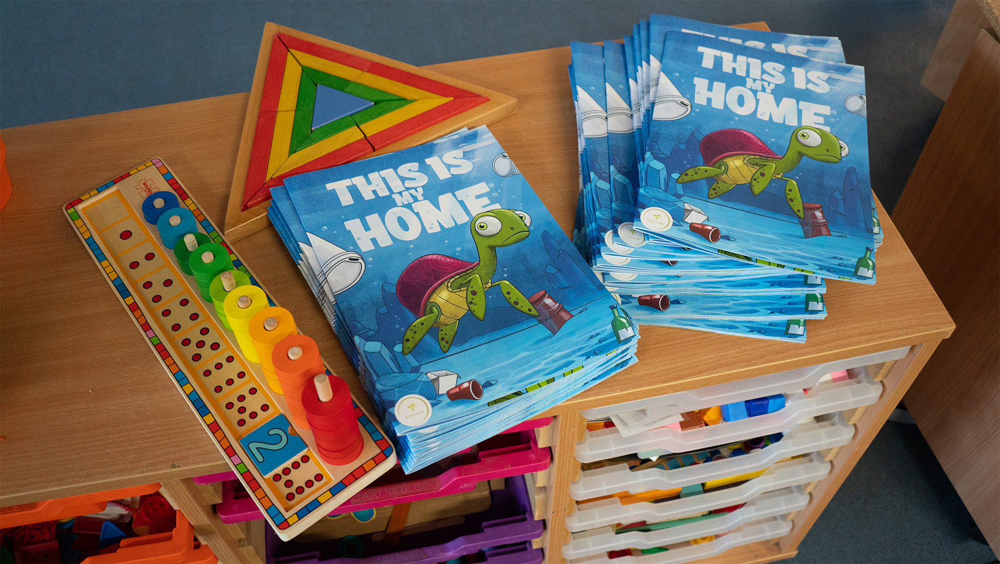
I developed assets for both the website and the app, with the latter eventually being released on both the App Store and Google Play Store. Additionally, I produced collateral such as brochures, shareholder updates, stickers, and more to support the company’s initiatives.
Frecycle Recycling Scope:
Logo
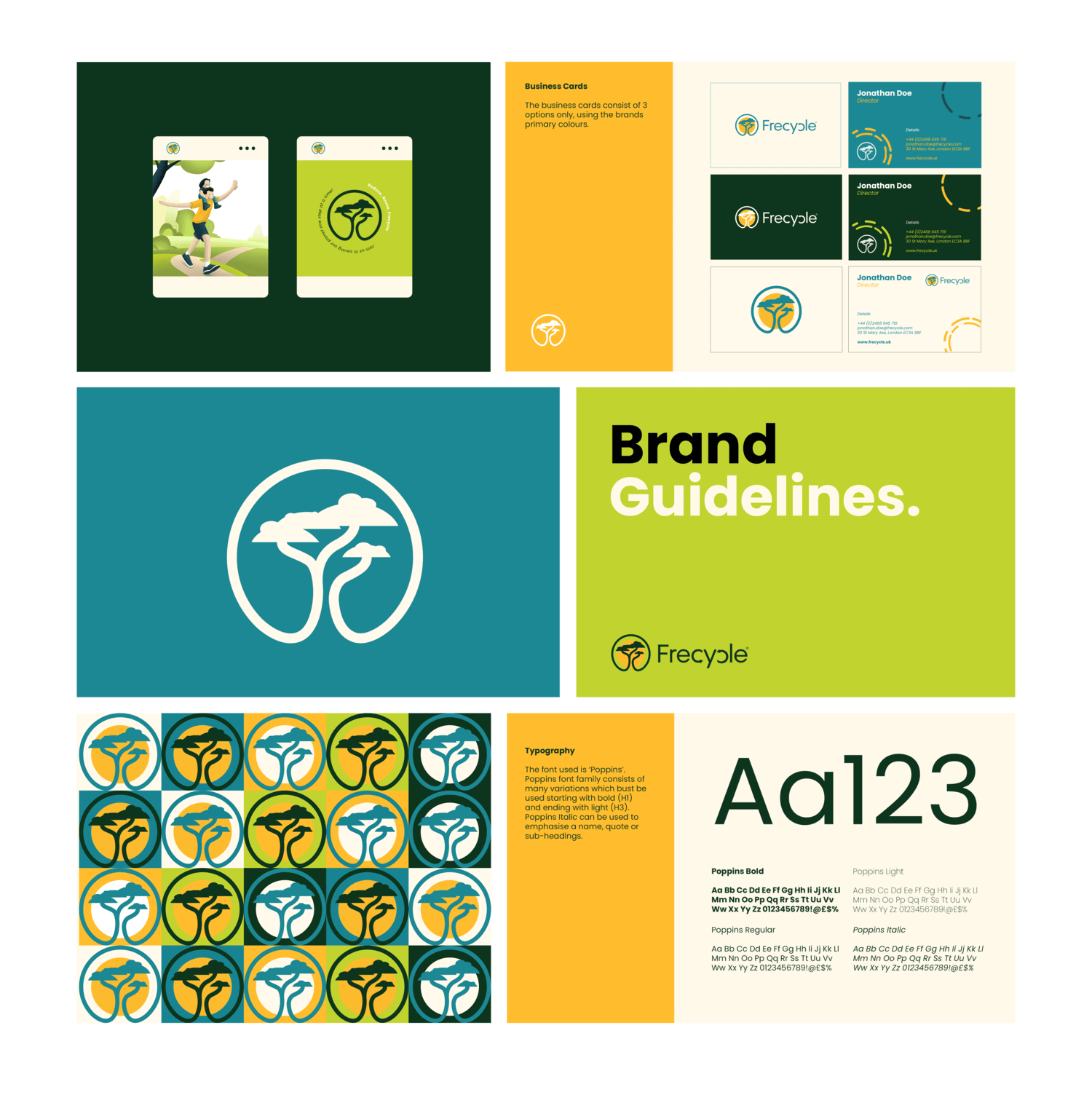
Brand guidelines
brochures, flyers etc.
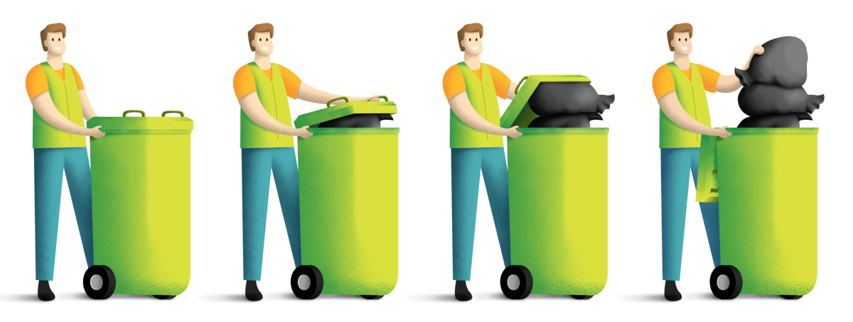
illustrations
app design
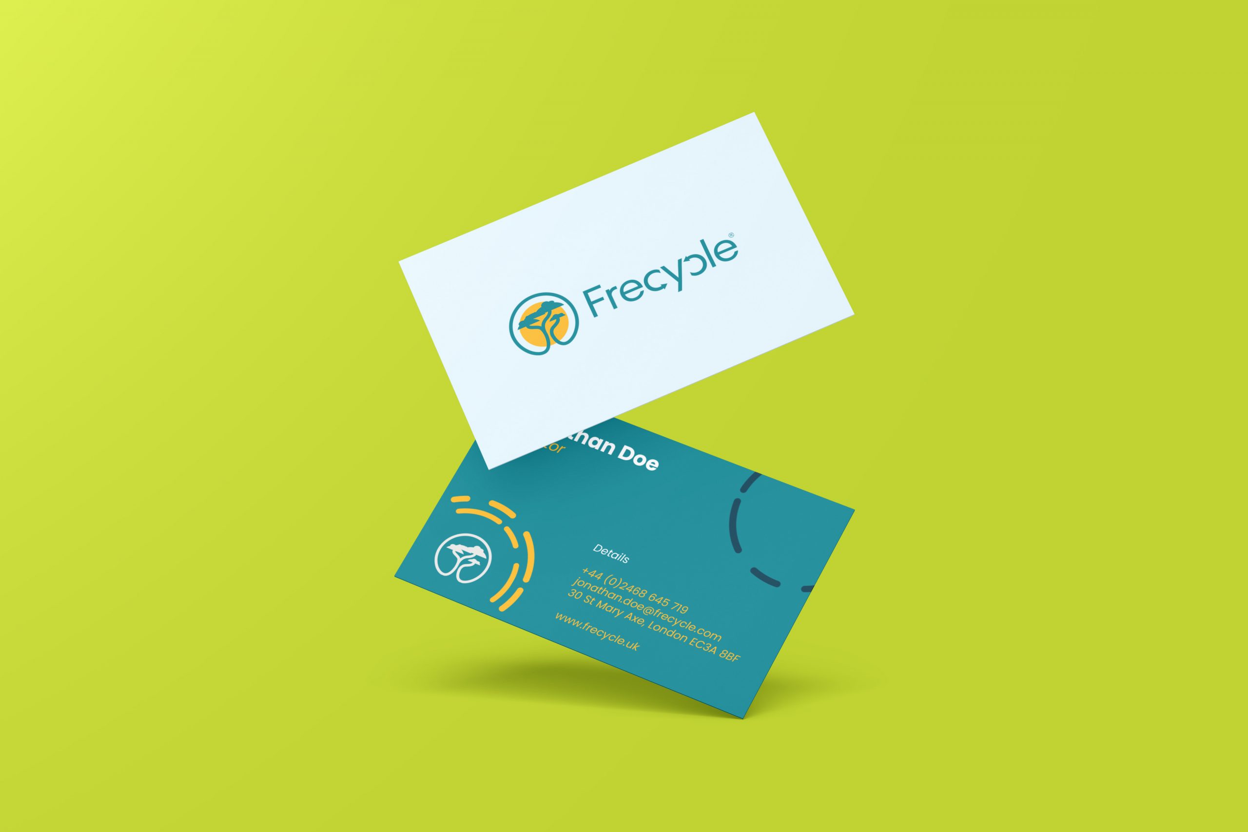
Business cards
Additional Credits:
Bert Hussein – CEO of Xcellorate
This showcases my contributions as a designer for Frecycle. I am not affiliated with the company or its current activities.
About Frecycle
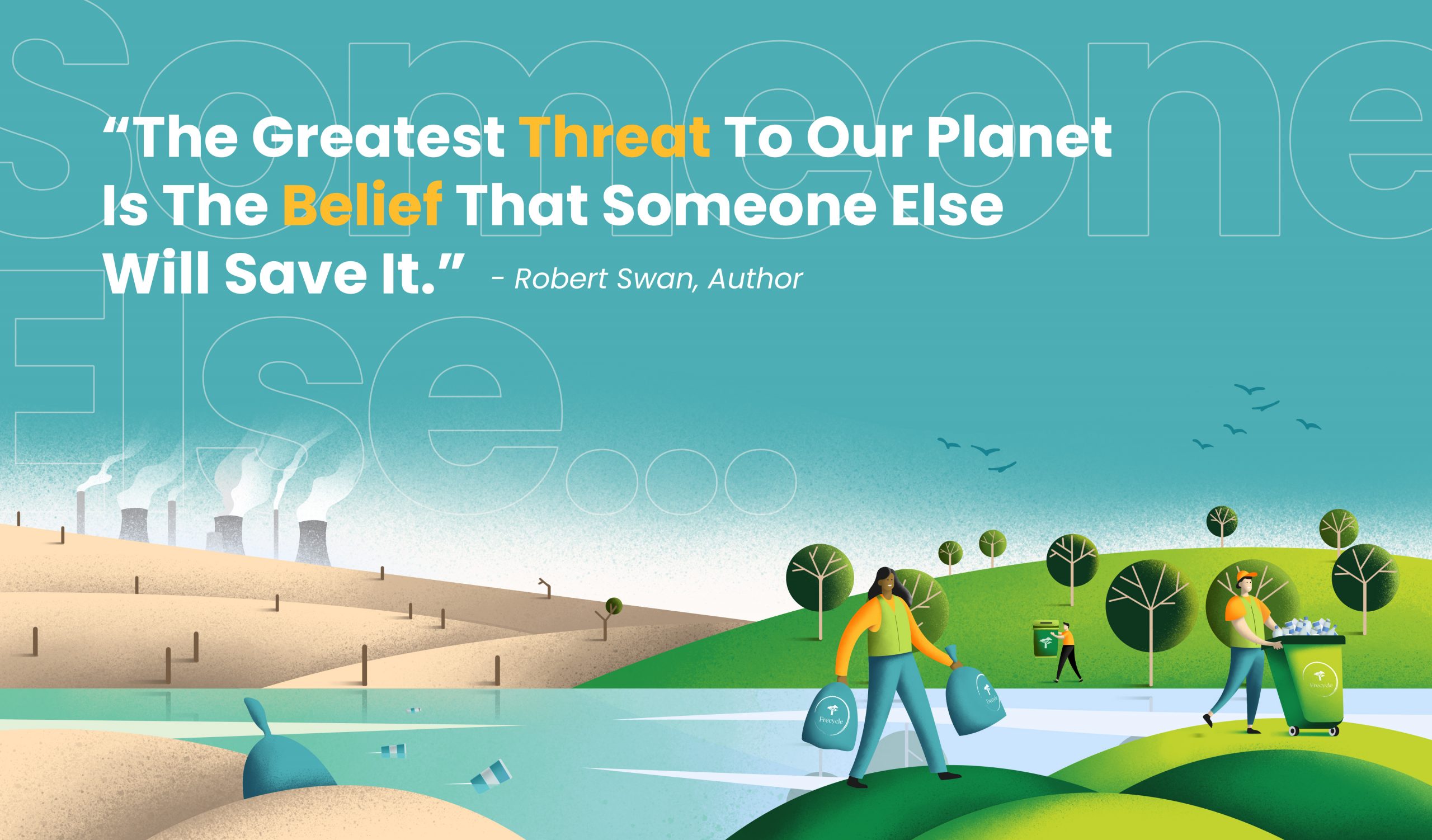
Frecycle, a startup focused on recycling, incentivized its users for participating in recycling efforts. Founded in 2022 with the aim of fostering a cleaner, improved environment, the company experienced successful operations during its initial two years. Regrettably, it ceased operations due to failure in meeting the demands of clients and shareholders.
Logo
The initial logo was crafted by a shareholder of Frecycle. However, I found it lacking in appeal, especially when scaled down for use on collateral like the app or website. Hence, I developed a logo that is both thought-provoking and aligns with contemporary design trends and market demands.
Before
After
Brand Tone & Visual Language
The Frecycle typography was selected for its boldness and readability across all font styles. It possesses a playful yet professional essence, engaging users in a welcoming manner without being confrontational.