Meraki rebranding, packaging and corporate identity design 2020
During my freelance period in South Africa, a client approached me to design her brand of homemade ice cream. The brief emphasised the creation of an appealing identity with Greek heritage embedded within it.
As evident, my original design from 2017 no longer aligns with contemporary design trends. Consequently, I undertook the task of rebranding her company at no additional cost. The new design significantly enhances the representation of Greek culture while maintaining the essence of the pattern that initially resonated with the client.
Meraki Ltd. Scope:
Logo Design
Rebranding
Marketing Material
Packaging
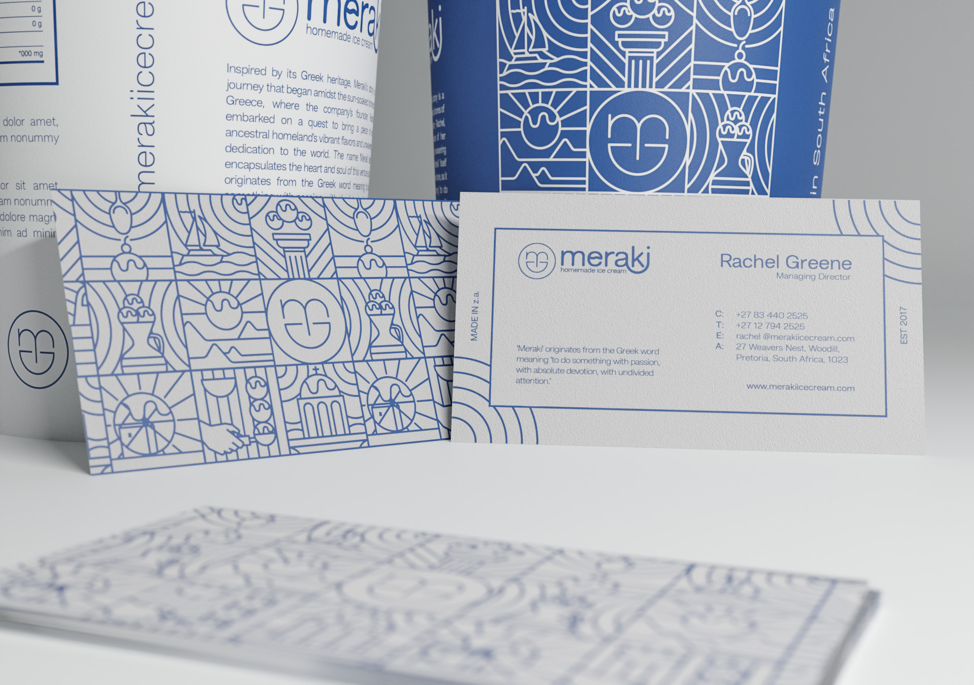
Business Cards
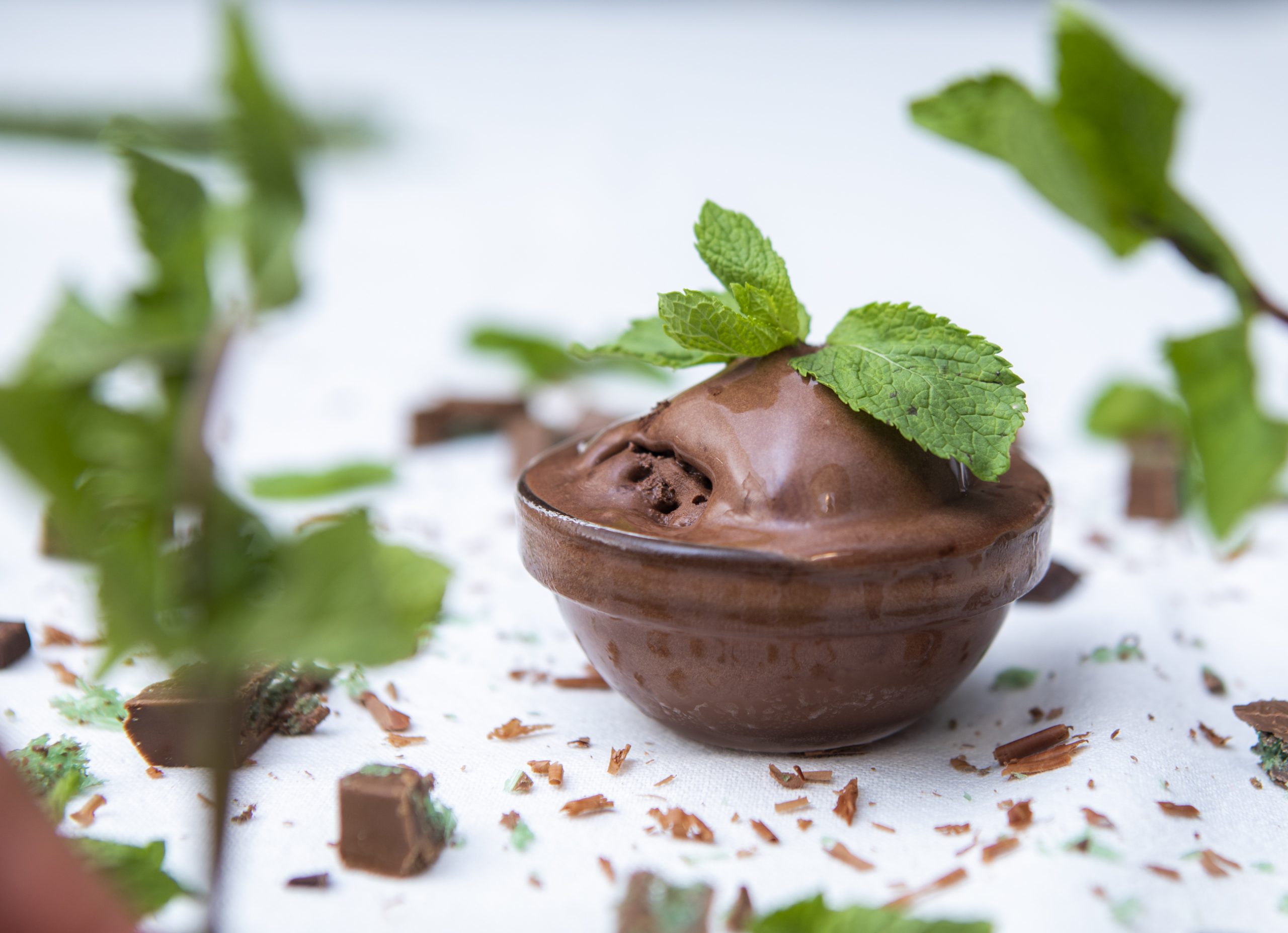
Product Photography
Additional Credits:
Photography by Darrell Fraser
About Meraki
The term “Meraki” originates from the Greek language, where it directly translates to the “essence of yourself.” However, its significance extends beyond linguistic boundaries, resonating across various cultures and languages, encapsulating a profound and universal concept. At its essence, “Meraki” embodies the act of engaging in activities with boundless creativity, unwavering passion, and profound love. This intrinsic philosophy serves as the cornerstone of the business, shaping its ethos and guiding principles. Consequently, the brand’s identity should have mirrored this fundamental value, reflecting the essence of “Meraki” in every aspect of its representation.
Logo
In my assessment, the logo I crafted back in 2017 appears overly playful and cluttered. To align with contemporary market preferences, it’s crucial for the branding to strike a chord with what customers gravitate towards and are accustomed to. Consequently, I undertook a redesign of the logo, opting for a more minimalist approach that is readily comprehensible.
Before
After
Brand Tone & Visual Language
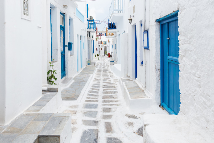
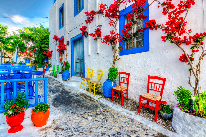
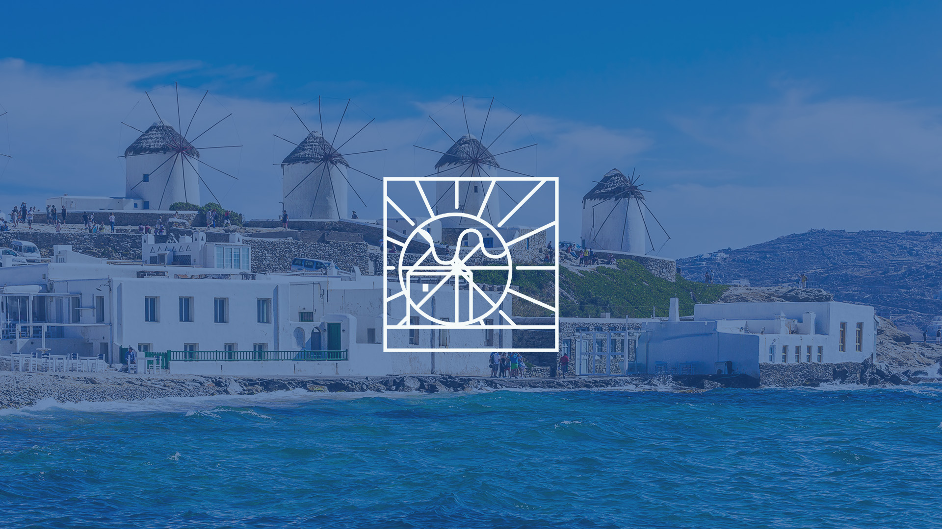
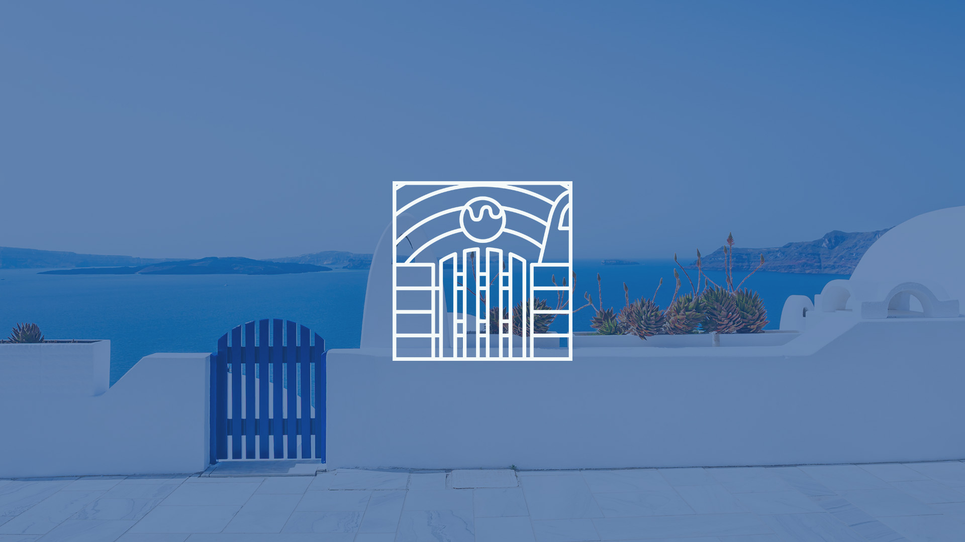
Meraki’s brand tone and visual language capture Greece’s essence and cultural richness. Inspired by its vibrant landscapes and warm hospitality, it evokes the joy of enjoying ice cream on sunny days in picturesque locales.
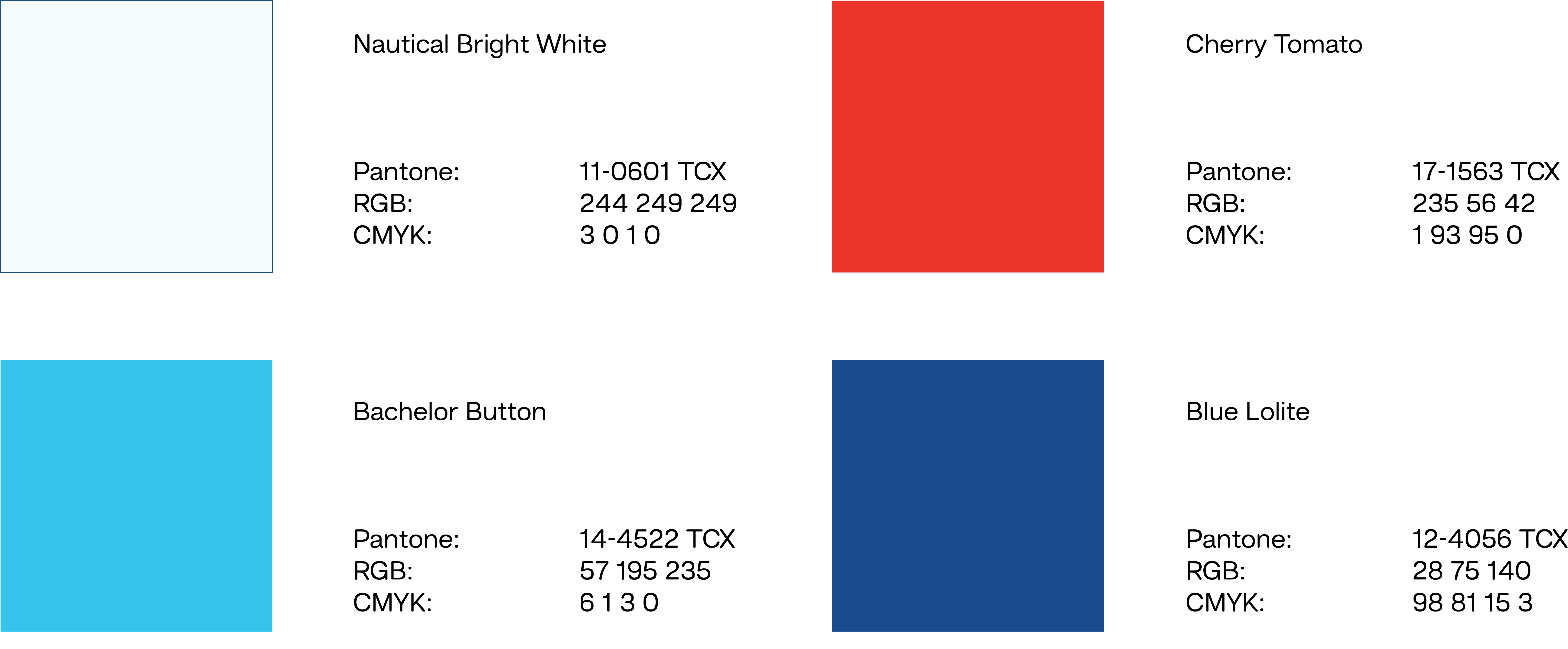
The colour palette mirrors Greece’s vibrant hues: azure blue for the Aegean Sea, pristine whites for Cycladic architecture, and pops of vibrant reds for the Mediterranean sun’s warmth.
Typography – Hando Soft
Hando Soft Bold
Lorem ipsum dolor sit amet, consectetur adipiscing elit. Ut elit tellus, luctus nec ullamcorper mattis, pulvinar dapibus leo.
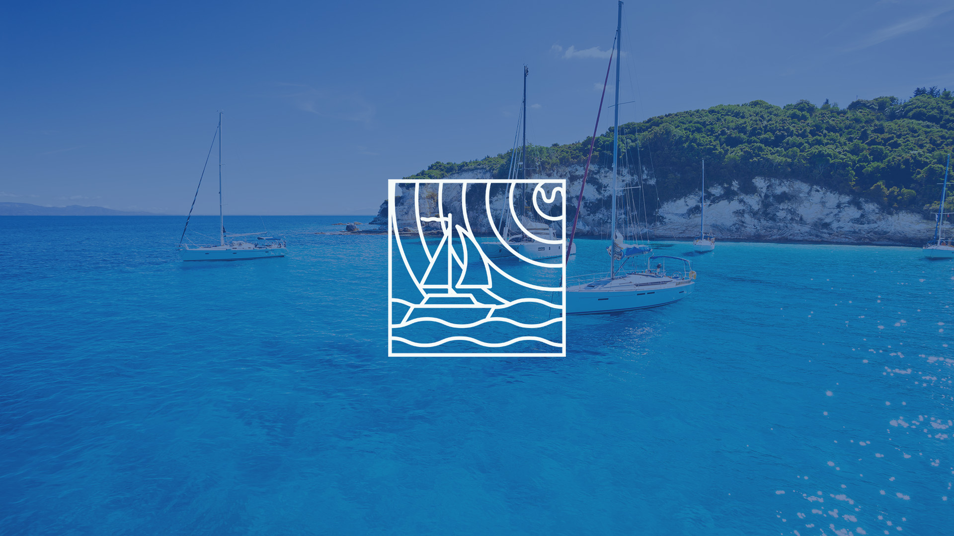
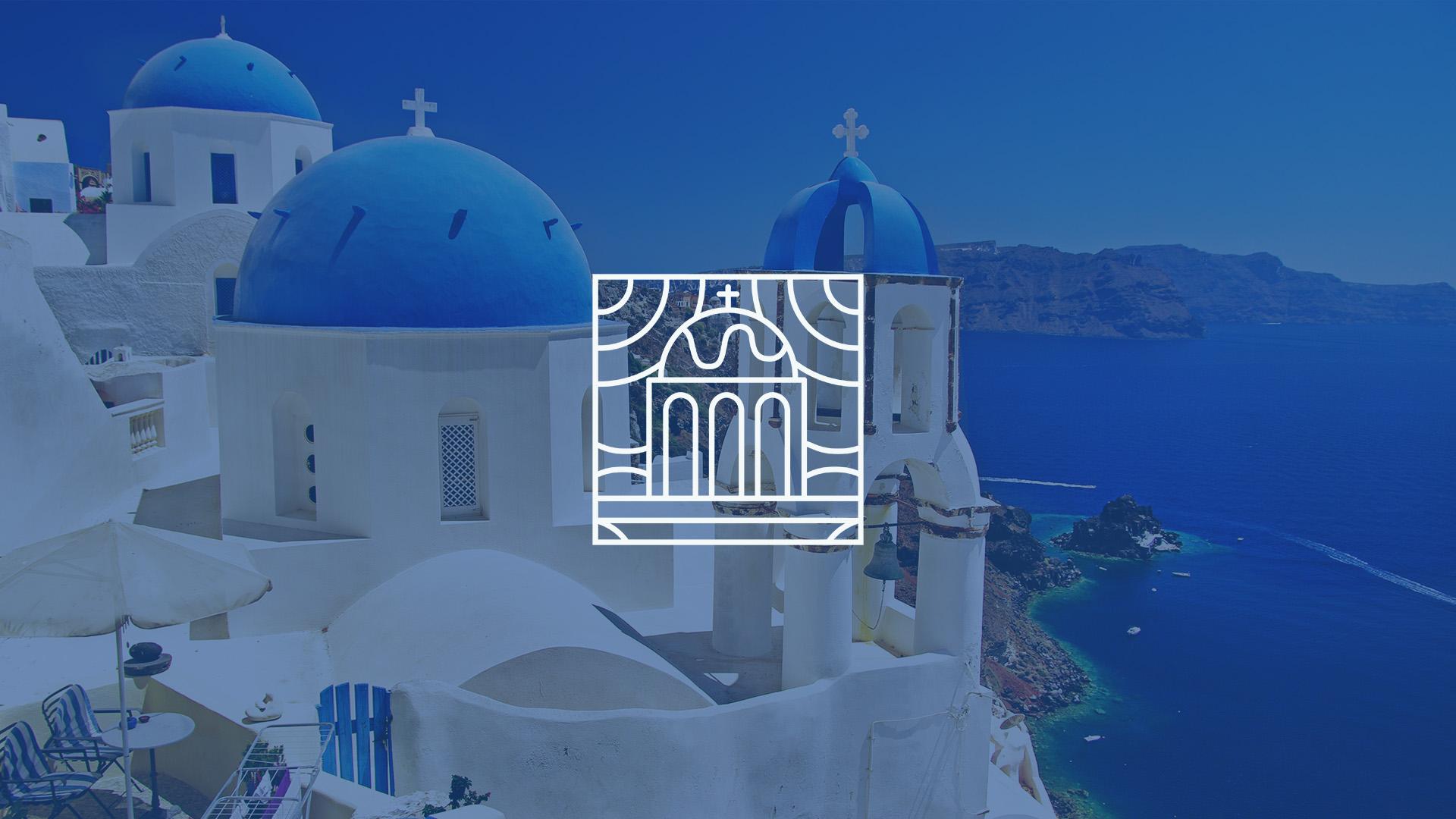
Through extensive research on Greece, I discovered that the predominant colors associated with the country are blue, white, and red. Drawing inspiration from places where I envision people enjoying ice cream, I aimed to infuse the essence of Greek culture into the brand.
Brand Identity
In order to authentically capture the essence of Greece and evoke the associations customers make when they think of the word “Greek,” I selected four primary colors. Coincidentally, some of these colors are also found in the flag of Greece.
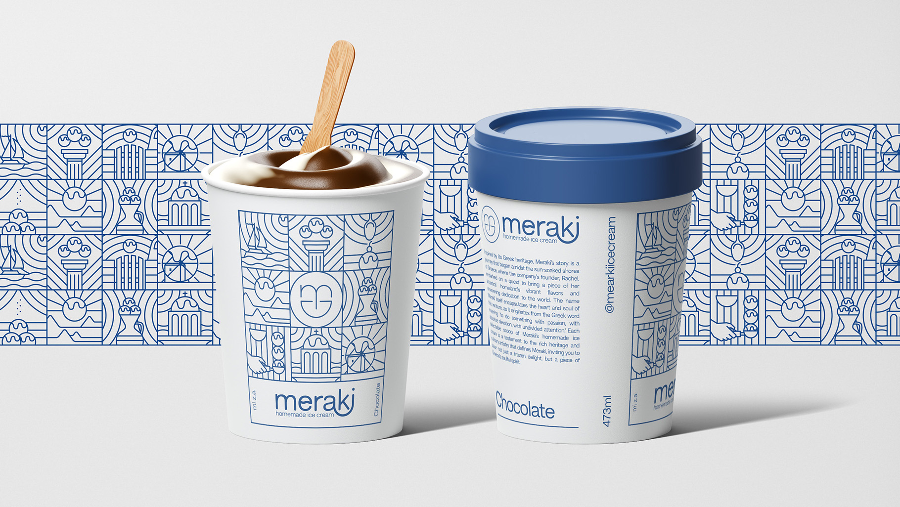
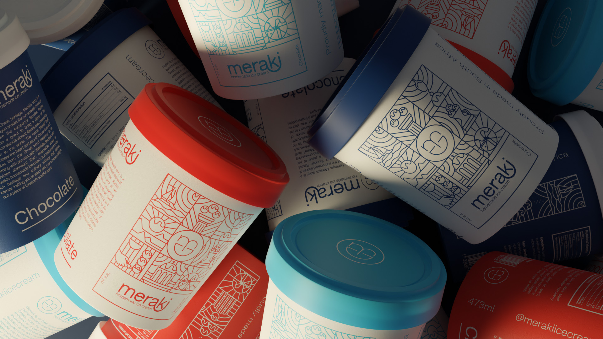
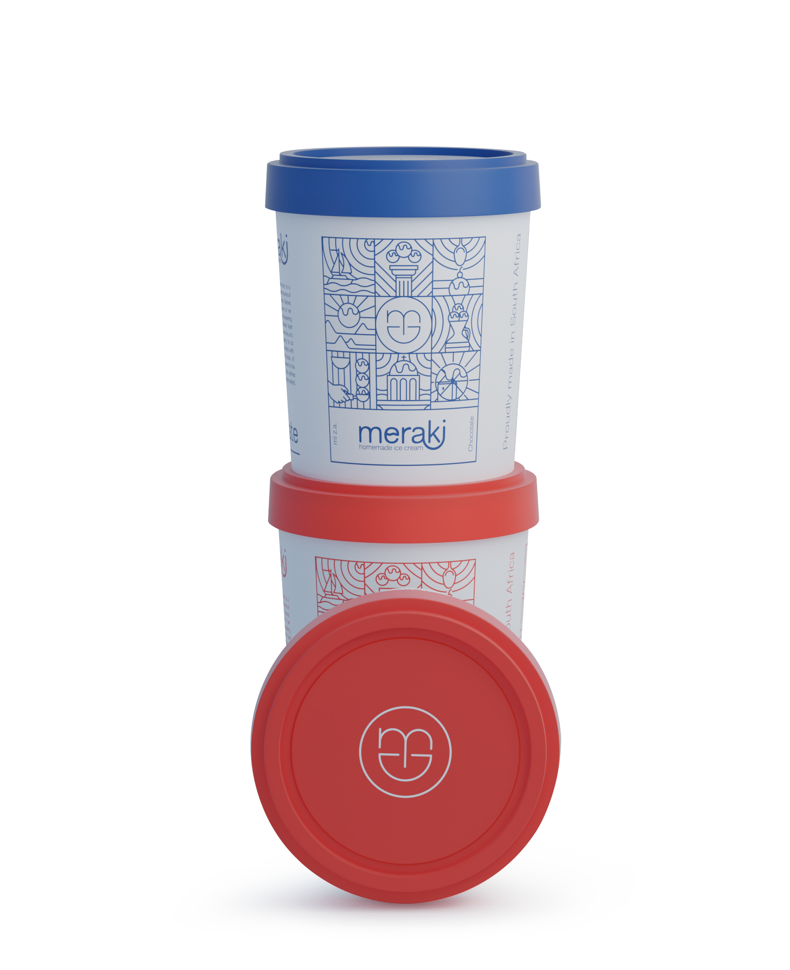
Packaging
Before (2017)
After (2020)
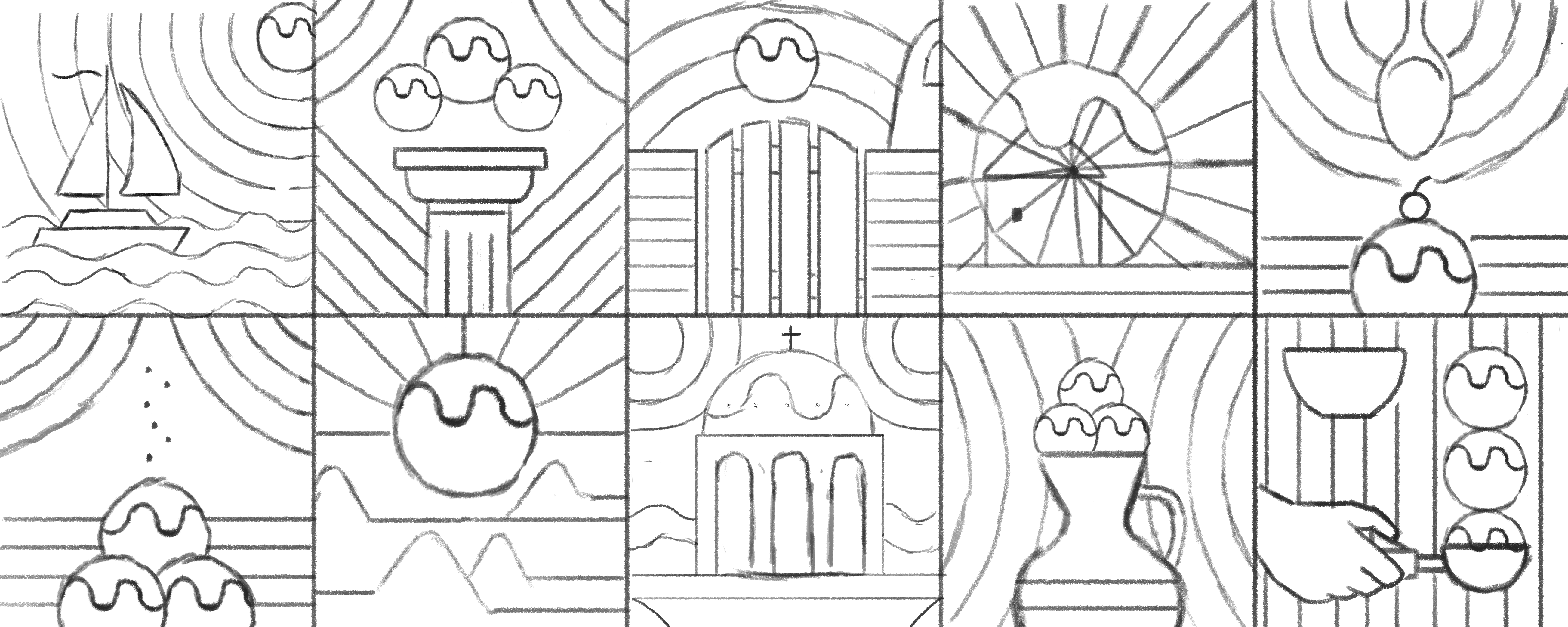
Illustration Style
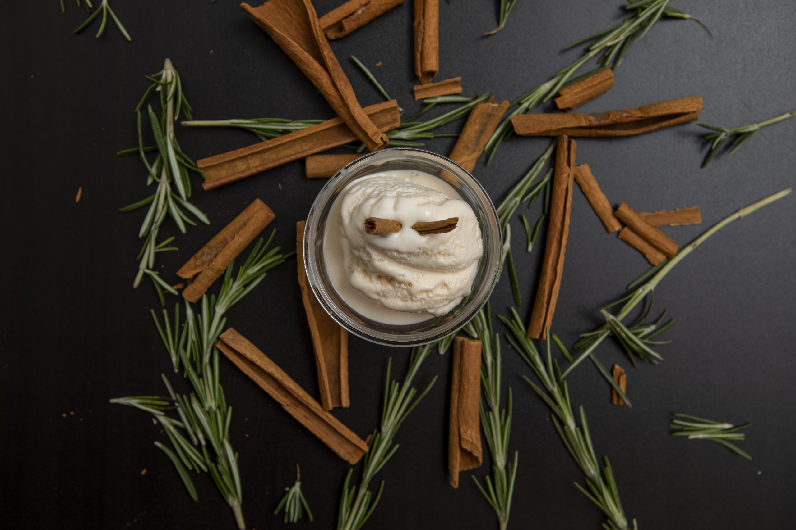
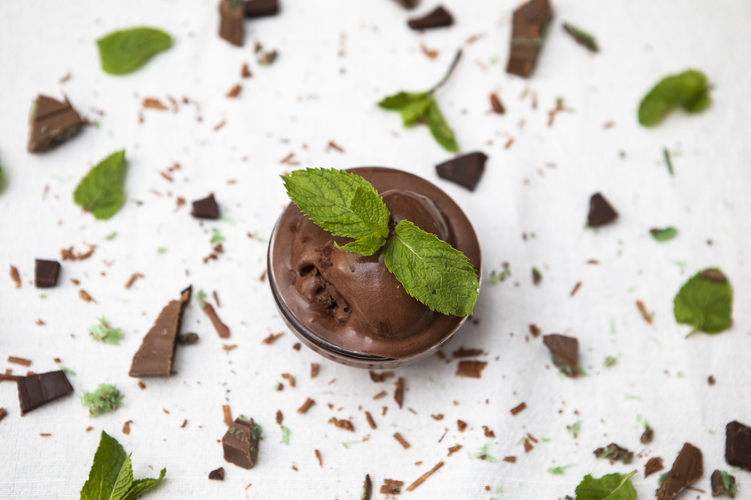
Once more, when considering the iconography and illustration of the brand, I found inspiration in the vivid imagery of hot, sunny days in Greece, where the simple pleasure of enjoying ice cream becomes a cherished experience. The intention was to evoke a sense of nostalgia and transport customers to the idyllic scenes of Greek summers, enhancing the overall brand experience and fostering a deeper connection with its cultural roots.